A2 PROJECT ASSIGNMENT: Listing Article Spread

A2 PROJECT ASSIGNMENT: Listing Article Spread

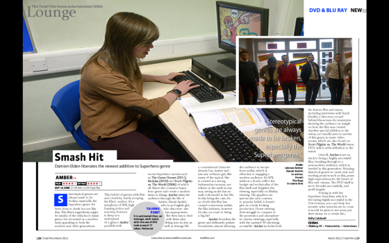
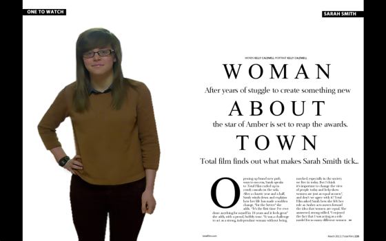
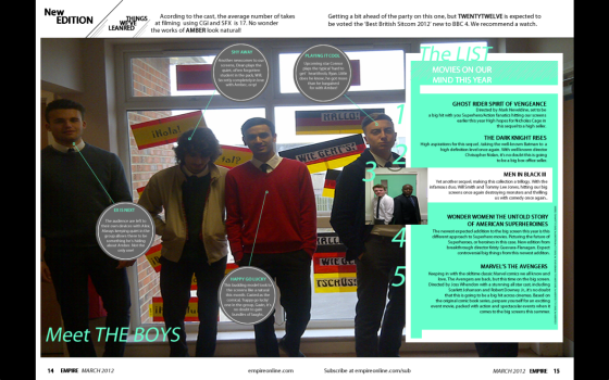
I found this design the most quirky and modern, definitely fitting to that of film genre magazines. I used the same image as found in the inset, which I thought made it recognisable and link all three articles together. The bubbles created little personality interview for each of the so called posing ‘characters’ which creates a bond between the reader and character through paper, and also gives the reader something striking to look at.

A2 PROJECT ASSIGNMENT: Review Article Spread

A2 PROJECT ASSIGNMENT: Review Article Spread

Here I kept with a very similar layout to Total Film, as of course our brief was to write a collection of articles to be published, theoretically, into a magazine of our choice. Using the conventional ‘film genre’ magazine graphic design layouts, I created a modern and recognisable layout, including an inset photograph and a main image central.

A2 PROJECT ASSIGNMENT: Interview Article Spread

A2 PROJECT ASSIGNMENT: Interview Article Spread

Moving on from year 12 to my final year of A-Level study, we had to create more print work individually to act as a collective piece for our final coursework. I chose to do an interview article spread (which is this document), a review article spread and a listing article spread. I chose the black and white modernistic style, and played around with the font size and positioning on the page to create a less conventional article.

(I have included the full view of the article in the post above)

AS PROJECT ASSIGNMENT: Main Interview Spread

AS PROJECT ASSIGNMENT: Main Interview Spread

Similarly to GCSE, we were provided with the choice of magazine, and we had to create articles to be published within that magazine. I chose Teen Vogue again as I felt that my pieces before were successful within the genre of Teen Magazines (although that genre is close to, if not entirely, dead now). The difference between AS and GCSE is that we had to use our own images for the pieces, rather than Google found images and this piece focused on editorial as well as design to decipher our strongest point.

COLLECTIVE PROJECT MEDIA STUDIES: Main Article Spread

COLLECTIVE PROJECT MEDIA STUDIES: Main Article Spread

Creating this spread, I had to ensure that the image was perfectly measured, using a bleed, and had no white edge border equally on both sides. I used to marginal tools on Fireworks to make sure the text and background matched perfectly, whilst still keeping the conventional Teen Vogue theme and ‘Elegant’ theme.

COLLECTIVE PROJECT MEDIA STUDIES – Cover Page

COLLECTIVE PROJECT MEDIA STUDIES - Cover Page

As can be seen in some of my other work on this blog, I used ‘ELEGANT’ – a self created title – and used Emma Watson as my model, as I know she previously modelled for Teen Vogue. I used a specific colour scheme that reflects the season the issue would theoretically be published in, which is Autumn, and the colours and Fashion pieces the model is wearing link in with the ‘vintage’ theme of the issue. I have used the recognisable brand Masthead.

Collective Project (Media Studies GCSE)

For my GCSE media studies, I had to create a magazine from scratch, basing layouts on conventional magazine layouts of my chosen genre (including typefaces and graphic design). I chose to base mine on ‘Teen Vogue’ as I was part of it’s intended, target readership. I have included images of 4 pages of the project; Cover, Contents, Main article double page spread (they can be found above labeled (COLLECTIVE PROJECT MEDIA STUDIES: nameofdocument)